

Introduction to Mobile Responsiveness
In today’s digital landscape, having a mobile responsive website is not merely an option but a necessity, particularly for fashion businesses such as Rato Fashion. As mobile devices continue to dominate internet usage, it is crucial that websites are designed to accommodate various screen sizes and resolutions. Statistics show that over half of all web traffic now originates from mobile devices, with this percentage steadily increasing. Consequently, a mobile-friendly design ensures that users can access content seamlessly, regardless of the device they are using.
Emphasizing user experience, responsive design enhances navigation through easy-to-click buttons, adjustable images, and well-structured layouts that adapt to screens of different dimensions. When visitors find it easy to engage with a website, they are more likely to stay longer, ultimately decreasing bounce rates. This translates into improved traffic and greater opportunities for conversion. Studies reveal that 67% of users are more inclined to make a purchase when they encounter a mobile-optimized website, highlighting the pivotal role of mobile responsiveness in boosting sales for fashion brands.
Furthermore, search engines such as Google prioritize mobile-friendly websites in their rankings, making responsive design an essential component for businesses looking to increase their online visibility. A website that is not optimized for mobile viewing may suffer from lower rankings and reduced traffic, which can adversely affect a business’s overall performance. In particular, for fashion retailers competing in a saturated market, a deficiency in mobile responsiveness could result in lost customers to more agile competitors.
Overall, the necessity of a mobile responsive website for fashion businesses cannot be overstated. In the fast-evolving retail environment, ensuring a consistent and engaging user experience across All devices is imperative for sustaining a competitive edge.
Understanding the Fashion Business Landscape
The fashion industry is a dynamic and ever-evolving sector characterized by a wide array of competitive players and constantly changing consumer preferences. In recent years, the rise of technology has drastically transformed how fashion brands operate and interact with their customers. As online shopping continues to gain traction, the importance of an effective online presence cannot be overstated. A well-designed and mobile-responsive website offers significant advantages, allowing brands like Rato Fashion to engage with their audience seamlessly and enhance their visibility in a saturated market.
Currently, key competitors in the fashion industry leverage their digital platforms to establish brand loyalty and drive sales. Companies such as Zara and H&M have successfully integrated e-commerce with their physical stores, creating a cohesive shopping experience for consumers. These brands showcase how a sophisticated web presence, complemented by mobile optimization, can facilitate greater consumer engagement and increase conversion rates. The functionality of their websites plays a critical role in navigating product offerings, leading to higher customer satisfaction and retention.
Rato Fashion can discern valuable insights from these leading brands to enhance its own online strategy. For instance, the implementation of user-friendly navigation, swift loading times, and visually appealing designs can significantly impact customer perceptions and behavior. An intuitive design that adjusts seamlessly across devices can elevate the shopping experience. Furthermore, an effective utilization of digital marketing strategies, like search engine optimization (SEO) and social media engagement, can drive traffic to Rato Fashion’s website, ensuring it stands out amidst fierce competition.
Ultimately, understanding the intricacies of the fashion landscape and the online behavior of consumers lays the foundation for Rato Fashion to leverage its website as a competitive advantage. Creating a mobile-responsive site that mirrors the quality of offerings will not only attract customers but also reflect the brand’s commitment to adapting in a fast-paced market environment.
Selecting the Right Technologies: HTML, CSS, and JavaScript
Building a mobile responsive website requires a careful selection of technologies that work harmoniously to deliver an optimal user experience. At the core of this development process are HTML, CSS, and JavaScript. Each of these technologies plays a distinct yet complementary role in crafting a site that is not only functional but also visually appealing and interactive.
HTML, or Hypertext Markup Language, serves as the backbone of the website, providing essential structure to the content. It organizes everything from headings and paragraphs to images and links, ensuring that search engines can effectively index the site. By adhering to semantic HTML5 standards, Rato Fashion can enhance search engine optimization (SEO), creating a strong foundation for visibility in competitive online environments.
On the other hand, CSS, or Cascading Style Sheets, is crucial for enhancing the aesthetics of the website. It allows designers to implement styles, colors, fonts, and layouts, transforming the bare structure provided by HTML into an engaging visual experience. Through CSS media queries, the site can adapt its design to various screen sizes, thereby ensuring a seamless mobile experience. This is particularly vital for Rato Fashion, as mobile users are a significant segment of the shopping market.
Lastly, JavaScript adds a layer of interactivity to the Rato Fashion website, enabling dynamic features such as image sliders, dropdown menus, and pop-up notifications. By utilizing JavaScript frameworks and libraries like React or jQuery, developers can create a more responsive interface that reacts in real-time to user actions. This interactivity is essential in attracting and retaining customers in an increasingly digital marketplace.
Ultimately, by strategically integrating HTML, CSS, and JavaScript, Rato Fashion can develop a robust mobile responsive website that not only meets aesthetic standards but also ensures functional excellence catered specifically to audience needs. The collective strength of these technologies will enhance user engagement, thereby providing Rato Fashion with a competitive edge in the increasingly crowded marketplace.
Designing the Sleek Polished Banner with Slideshow
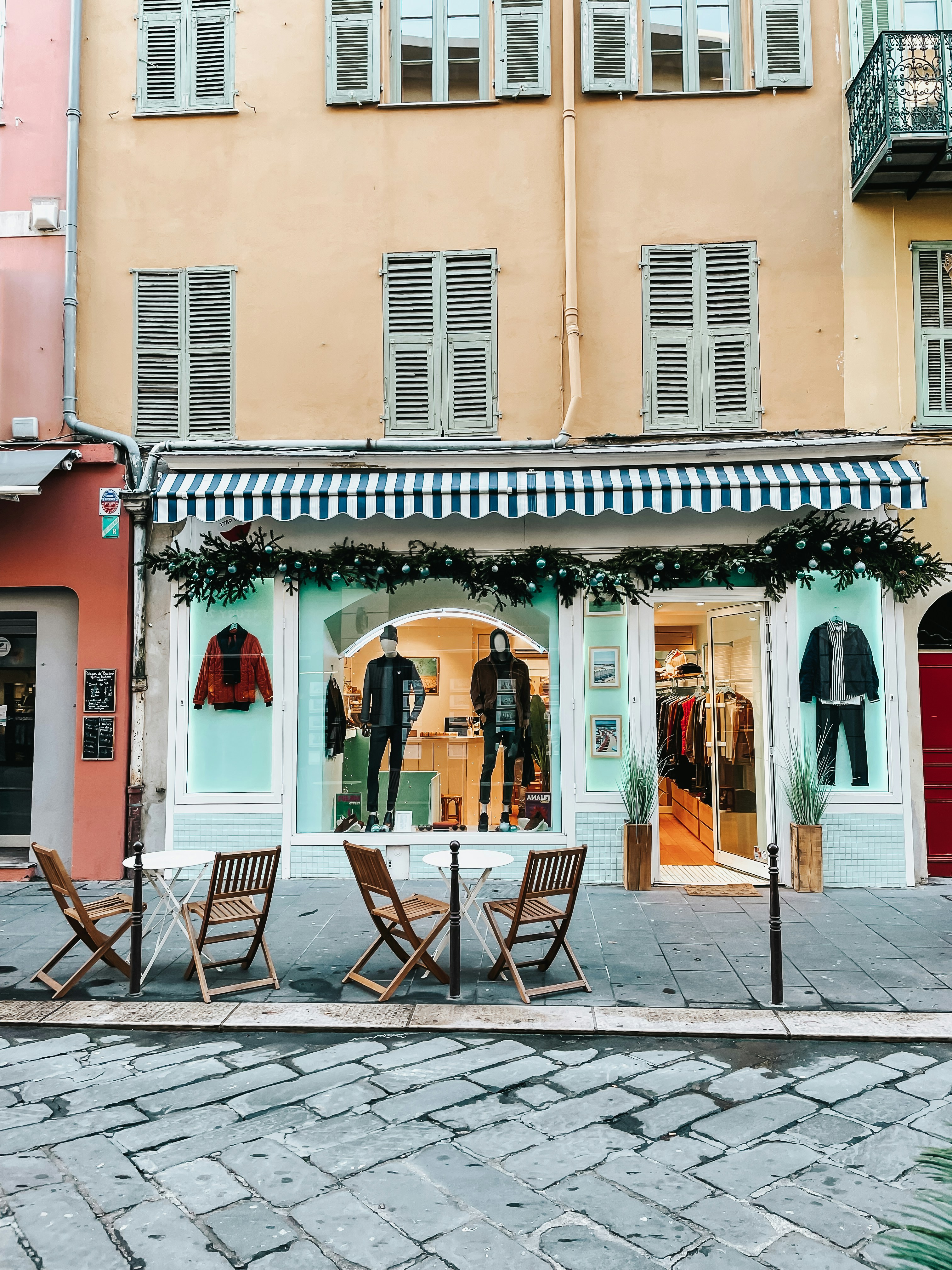
In the rapidly evolving world of fashion marketing, visual impact plays a critical role in capturing the attention of potential customers. A well-designed homepage banner is often the first impression a visitor has of Rato Fashion, making it essential to create a striking and polished visual presentation. The main objective is to encapsulate the brand’s identity while enticing users to explore further. This begins by selecting suitable images that resonate with both the brand ethos and the target audience.
When choosing images for the banner, it is crucial to opt for high-quality visuals that showcase Rato Fashion’s unique offerings. These can include vibrant product pictures, lifestyle shots, or even runway images that evoke a sense of aspiration and desirability. The selected images should reflect the latest fashion trends and align with the overall theme of the website. Moreover, employing a cohesive color scheme that complements the imagery can enhance the aesthetics further, contributing to a polished look and feel.
In addition to visual appeal, the technical aspects of implementing a slideshow feature merit attention. A slideshow not only allows for multiple images to be displayed sequentially but also lends dynamism to the webpage. To maximize user engagement, it is vital to optimize the slideshow for mobile responsiveness. This means ensuring that the images resize appropriately and maintain clarity across various devices. Using CSS or JavaScript frameworks, designers can create seamless transitions between images that do not compromise load times or user experience.
Overall, the design process of the banner—combining strategic image selection with a functional slideshow—serves as a cornerstone of Rato Fashion’s competitive edge in the digital marketplace. By prioritizing visual impact and technical excellence, the banner can effectively engage visitors, encouraging them to immerse themselves in the world of fashion that Rato has to offer.
Essential Pages for Rato Fashion Website
In establishing a robust online presence for Rato Fashion, it is imperative to create essential pages that cater to both functionality and user experience. The foundation of a successful fashion website lies in the diverse pages it houses, each serving a distinct purpose in enhancing interaction with potential customers.
The Home page acts as the gateway to the Rato Fashion brand, presenting visitors with a visually appealing layout that highlights new arrivals, promotions, and curated collections. This page should reflect the brand’s identity and make a lasting first impression. It establishes the tone for what visitors can expect from the rest of the website.
Following the Home page, the About Us page fosters a connection with the audience by sharing the brand’s story, values, and mission. This page allows Rato Fashion to convey its unique selling points, thus building trust and establishing a sense of loyalty among consumers.
The Shop page is crucial as it showcases the product range available for purchase. This section should be designed with user-friendly navigation, allowing customers to filter items by categories, sizes, and prices. High-quality images and detailed product descriptions enhance the shopping experience, directly impacting conversion rates.
The Blog page offers an avenue for engagement beyond mere transactions. Here, Rato Fashion can share fashion tips, industry news, and lifestyle content, positioning the brand as a thought leader in the fashion space. Regularly updated blog content can also improve search engine visibility, driving organic traffic to the site.
Additionally, a Contact page is essential, providing customers with a way to reach out for inquiries, feedback, or support. This fosters good customer relations and enhances the overall user experience. Lastly, clear Policy pages covering shipping, returns, and privacy issues are necessary to ensure transparency and compliance with marketplace standards.
By thoughtfully integrating these essential pages, Rato Fashion can create a comprehensive website that not only meets customer expectations but also stands out in the competitive fashion marketplace.
Implementing a User-Friendly Navigation System
In the contemporary digital landscape, a user-friendly navigation system is paramount for mobile websites, especially for brands like Rato Fashion. Mobile users typically seek quick access to information, and an intuitive navigation interface ensures they can effortlessly find the items they are looking for. This need underscores the importance of clear menu structures and logically categorized product categories.
The first step in designing a successful navigation system is to simplify the main menu. It is advisable to limit the number of top-level categories to five or six, reducing user overwhelm. Each of these categories should be descriptive, allowing users to understand quickly what they will find within them. For instance, Rato Fashion could use terms like “New Arrivals,” “Best Sellers,” and “Sale” to guide customers seamlessly to their desired products. Utilizing icons alongside text labels may further enhance usability, especially on smaller screens where space is limited.
Another effective strategy involves the implementation of a search feature. For mobile devices, an easily accessible search bar can significantly improve the user experience by enabling customers to type in specific queries. Auto-suggestion in search results can further streamline this process, presenting users with popular options as they type, effectively reducing the time it takes to locate a product.
Moreover, the inclusion of breadcrumb navigation can provide added context by indicating the user’s current location within the website’s hierarchy. This feature not only empowers users to backtrack easily through their navigation path but also enhances their overall sense of control. Additionally, considering thumb-friendly design by placing important navigation elements within easy reach can prevent accidental clicks and improve the browsing experience.
Overall, a well-structured navigation system fosters ease of use, encouraging visitors to stay longer and explore more. By ensuring that Rato Fashion’s website implements these best practices, the likelihood of conversions and customer satisfaction will undoubtedly increase.
SEO Optimization for Better Visibility
Search Engine Optimization (SEO) serves as a critical tool for enhancing the visibility of fashion e-commerce websites like Rato Fashion. In today’s digital landscape, an effective SEO strategy can significantly influence a website’s ability to attract organic traffic. This is particularly important for fashion brands that must compete in a saturated marketplace, where standing out in search results is essential for driving conversions.
To begin optimizing the Rato Fashion website, it is vital to conduct keyword research to identify terms that potential customers are using when seeking fashion products online. Integrating these keywords naturally into the website’s content is crucial for SEO success. Page content should be informative and engaging while focusing on relevant keywords to improve search engine ranking. This approach ensures that visitors not only find the Rato Fashion website but also remain engaged with the content offered.
In addition to content optimization, enhancing meta-tags is another essential strategy. Each page should have unique title tags and meta descriptions that accurately reflect the page’s content while incorporating targeted keywords. These elements play a significant role in how search engines interpret the relevance of a page, influencing click-through rates for search results. Additionally, using header tags effectively can help organize content and signal its structure to search engines, further improving SEO performance.
Image optimization is equally critical for fashion e-commerce sites, as visuals are paramount in this industry. All images should be compressed to enhance loading speed and labeled with descriptive, keyword-rich alt text. This not only aids in better indexing by search engines but also provides a more accessible experience for users. Implementing these strategies effectively will help Rato Fashion improve its visibility in search engines, ultimately leading to increased website traffic.
Testing and Launching the Mobile Responsive Website
After designing a mobile responsive website for Rato Fashion, the next critical phase involves an extensive testing process to ensure compatibility across various devices and browsers. This stage is pivotal as it assesses how the website adapts to different screen sizes and resolutions, ensuring that all users have a seamless experience irrespective of their device. Testing should begin with a thorough review of the website layout on popular mobile devices, such as smartphones and tablets, since the majority of web traffic now originates from these platforms.
Utilizing browser developer tools can greatly assist in this phase. These tools allow developers to simulate various devices and screen sizes, offering a clear view of how content appears across different configurations. Furthermore, it is essential to test the website on multiple browsers, including Chrome, Safari, Firefox, and Edge, as variations in rendering can lead to display issues that need to be addressed promptly. Testing not only focuses on visual aspects but also evaluates functionality, including navigational elements, forms, and any interactive features. Each component should work flawlessly, preserving the site’s intended user experience.
Upon identifying issues, they must be prioritized and resolved efficiently. This may entail adjusting CSS styles, modifying JavaScript functionality, or even reevaluating the content layout. It is advisable to perform cross-browser testing with tools such as BrowserStack or Sauce Labs, which can automate the process and provide comprehensive feedback. Before the final launch, conducting user acceptance testing (UAT) with a select group of potential customers can yield valuable insights, revealing additional areas for improvement.
Quality assurance is vital; a well-tested website minimizes risks post-launch and enhances user satisfaction, contributing positively to Rato Fashion’s brand image. Therefore, dedicating sufficient time and resources to this testing phase is critical for achieving a successful launch of the mobile responsive website.
Post-Launch Strategies: Marketing and Engagement
Following the successful launch of the Rato Fashion mobile-responsive website, it is crucial to implement effective post-launch marketing strategies to enhance visibility and engagement. One of the most powerful platforms for this purpose is social media. Engaging with potential customers on platforms such as Instagram, Facebook, and Pinterest can create buzz around the brand and encourage users to visit the new site. Regularly updating these channels with high-quality visuals of the latest fashion pieces, promotional offers, and customer testimonials can keep the audience engaged and interested in the brand’s offerings.
In addition to social media marketing, email campaigns serve as an essential tool in maintaining ongoing communication with customers. Building a mailing list during the website’s launch phase allows Rato Fashion to send curated newsletters highlighting new collections, exclusive promotions, or upcoming events. Personalization in these emails can significantly enhance customer engagement; addressing recipients by their names and recommending products based on previous purchases can foster a stronger connection between the brand and its customers.
Interactive elements also play a pivotal role in customer engagement post-launch. Implementing surveys or polls regarding fashion preferences can provide valuable insights for Rato Fashion. Engaging customers through contests or giveaways on social media can also boost traffic to the site. By encouraging customers to share their experiences on their platforms, Rato Fashion can tap into organic promotion from satisfied buyers, which can lead to increased brand awareness.
Moreover, leveraging influencers within the fashion industry can further amplify Rato Fashion’s reach. Collaborating with well-known influencers and fashion bloggers to showcase the website’s offerings can lend credibility and attract their followers to explore the new mobile-responsive site. Overall, a combination of strategic social media utilization, effective email communication, and active customer involvement can significantly enhance post-launch engagement and drive sustained traffic to the Rato Fashion website.